

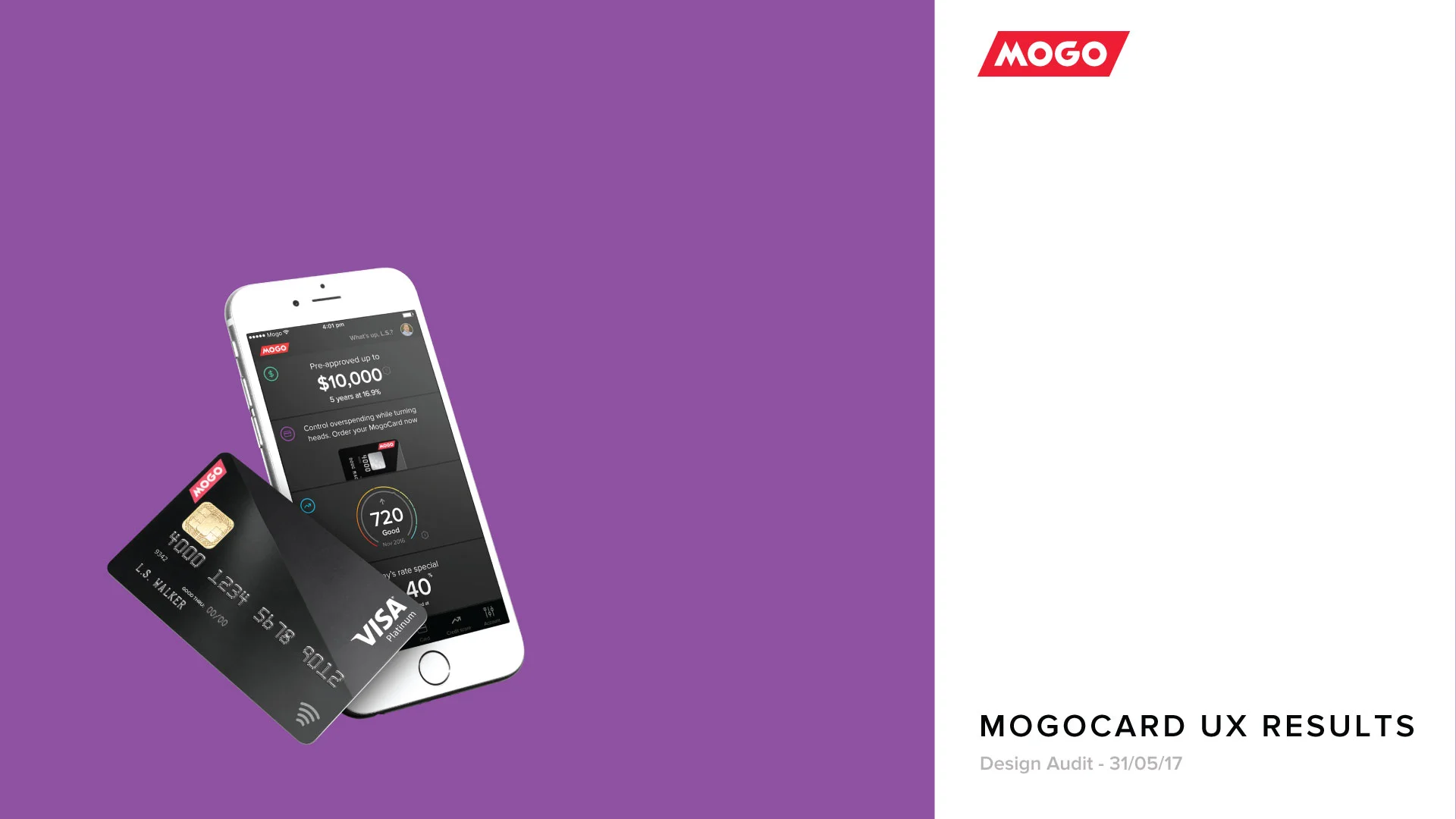
Mogo Spending Account
A digital experience to control the overspending
Spending Account project - Overview
The Spending Account product were designed to help users to control their spending by sticking to their budget for the extra spends. By creating a Spending Account, user gets a Prepaid Visa MogoCard that let them add money instantly from their bank account. Although Spending Account is an old project, it needed to be redesigned from scratch. The product needed to be simple, efficient and keep educating users how to stick to their financial goal.
I have been working for over 2 years on this project from end-to-end, from research to execution across Web and native iOS/Android apps and under Agile process. It was launched end of 2016 by a limited number of invites, then carefully tested with real user. Since first quarter of 2017, It has been gradually put on market for the 800K+ Mogo users.
Design Thinking process
First of all, I think important to share Design Thinking process for this project. Although every project requires different ways and techniques to solve specific problems, here is the methodology applied to this one:

Challenges
One of the main challenge of the product was to make the long and necessary process of creating a spending account easy and pleasant, aiming to avoid high number of drop-offs in the middle of the process. Among other challenges, we needed to understand how users use the MogoCard and, therefore, come up with solutions for how to educate them to stick with their budget.
Research
I've been working on few ways to get as much information as we can from users to understand what problems we want to solve, who our users are, how they behave using our product, what they need in order to achieve their goals and our goals as business, etc. By creating personas and user journey mapping, conducting surveys and interviews, collecting analytics results, I could understand user and business requirements as well as development resources and limitations.
User Journey Mapping
As part of understanding how users interact with our product and what are the pain point, moment of truth etc, I've been constantly working on the user journey mapping. Among numerous new relevant information that I get from that, some of the pain points I thought was quite interesting to find out and was really key improve the user experience:
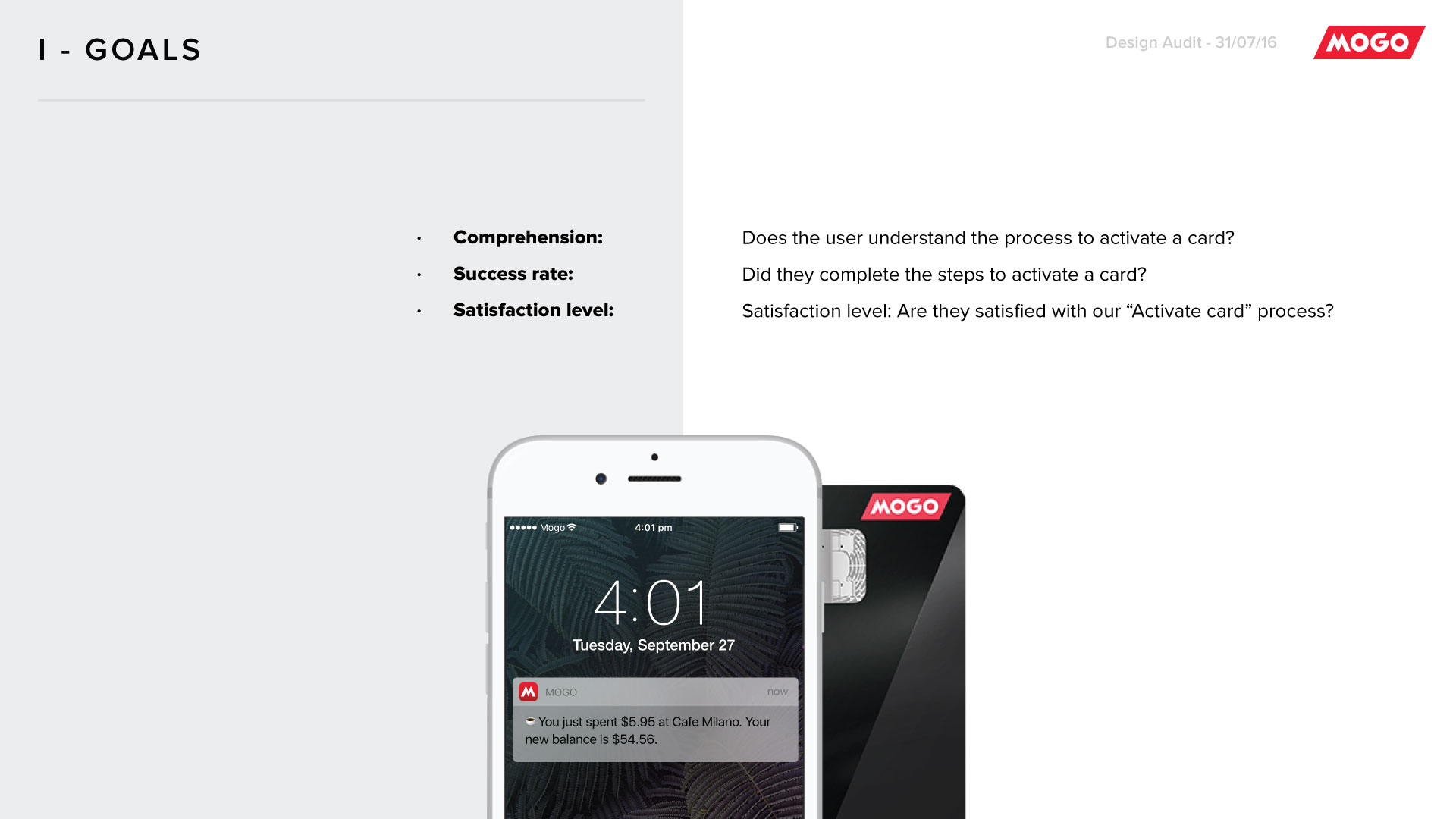
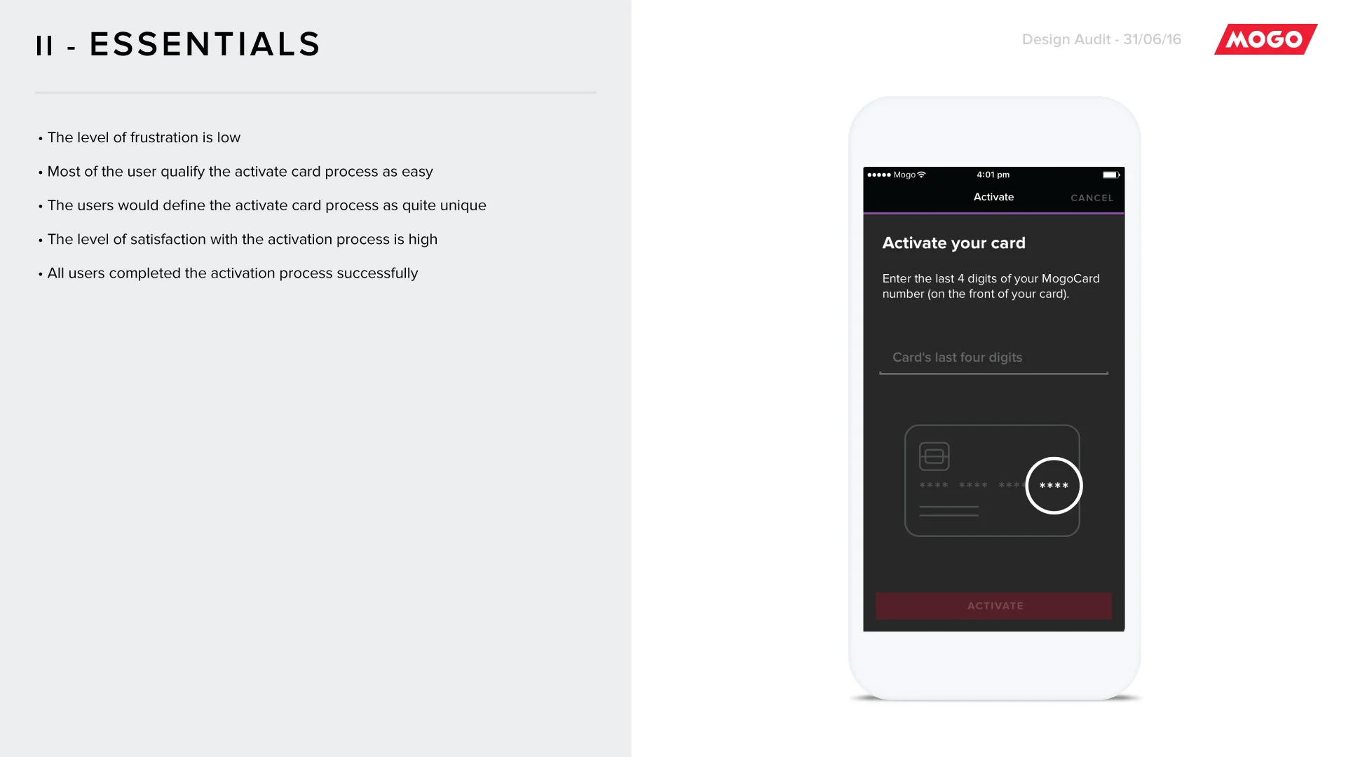
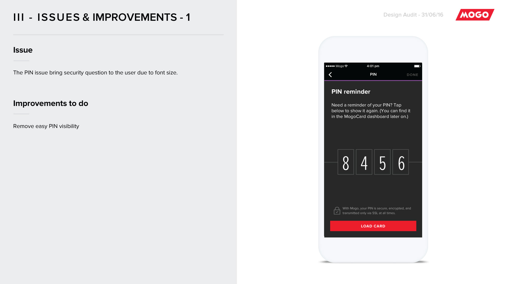
Confusion on ordering MogoCard: Users get their pre-paid card in the mailbox and needs to activate it in order to start using it. The instructions about how to activate it can be confusing and a hassle.
Frustration on adding money for the first time: Users don't know exactly how much their extra spends are, therefore, they don't know how to start tracking the spends and stick to a specific budget.
Frustration on adding money when the system is down: Users want to instant add money to their Spending Account but the system is down. Users have the option to do it at Canada Post, but they don't know how to approach the cashier, and cashiers are not well trained to offer this service.

Preview of MogoCard User Journey Map: lots of learning about users.
Execution
On the beginning of this project, it was needed to focus on the Information Architecture of the entire Member Dashboard. I worked together with the rest of the design team in order to come up with a solid site map for the new Mogo Dashboard. This was an essential step to start working on the Spending Account product. Following a roadmap created by product managers, I worked on each feature at a time. It started from feature requirement meetings, then creation of user tasks/flows. Every single scenario needed to be reflected on the user flow, including happy and unhappy paths, and validated by PO, PM, lead designer and developers (front-end and back-end).

First ideas of user flow for creating a Spending Account
Final user flow for creating a Spending Account
Once user flow was approved, I worked on wireframes. Those wireframes have been quite pixel perfect for two main reasons: avoid surprises in terms of layout changes on UI stage and increase efficiency when moving to UI. On both UX and UI stages, I worked on 10 different screen sizes for every screen created in order to avoid assumptions from the developers and guarantee the high-quality of the final product. This stage of the process evolves understanding human perception and attention, implementing Interaction Design Best Practices and WCAG 2.0 standards, as well as developing navigational concepts, functions and content.

Wireframes for Creating a Spending Account: Steps split into single questions in order to make the process easy and simple.

Final mockups for Creating a Spending Account.

Example of how I designed for multiple screen sizes/platforms.
User testing to validate the concepts
On UX and UI stages, prototypes had been created in order to be tested remotely and in person. I also took advantage of the testing to conduct satisfaction and values surveys. Some of the user testings helped me to also conduct contextual research, like watching user using the Prepaid Visa MogoCard in store. The results not only showed me what was working and not working on the product, but also helped me to improve the user journey mapping.
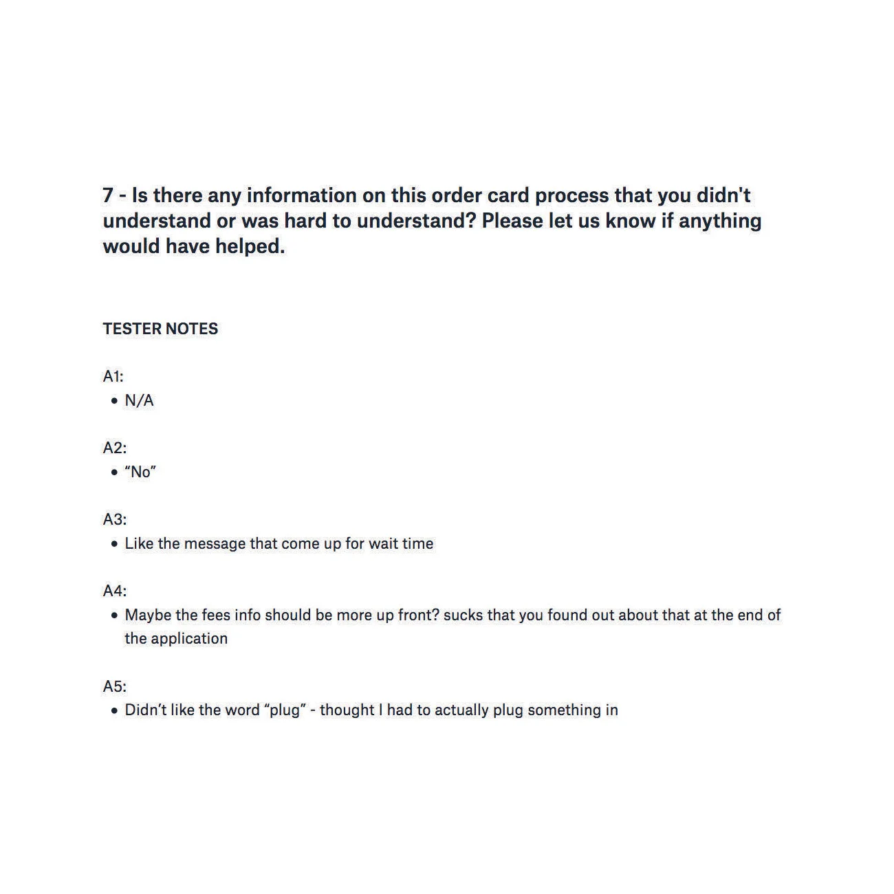
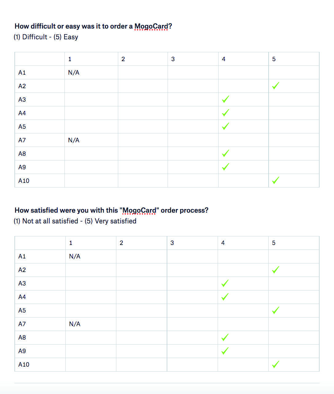
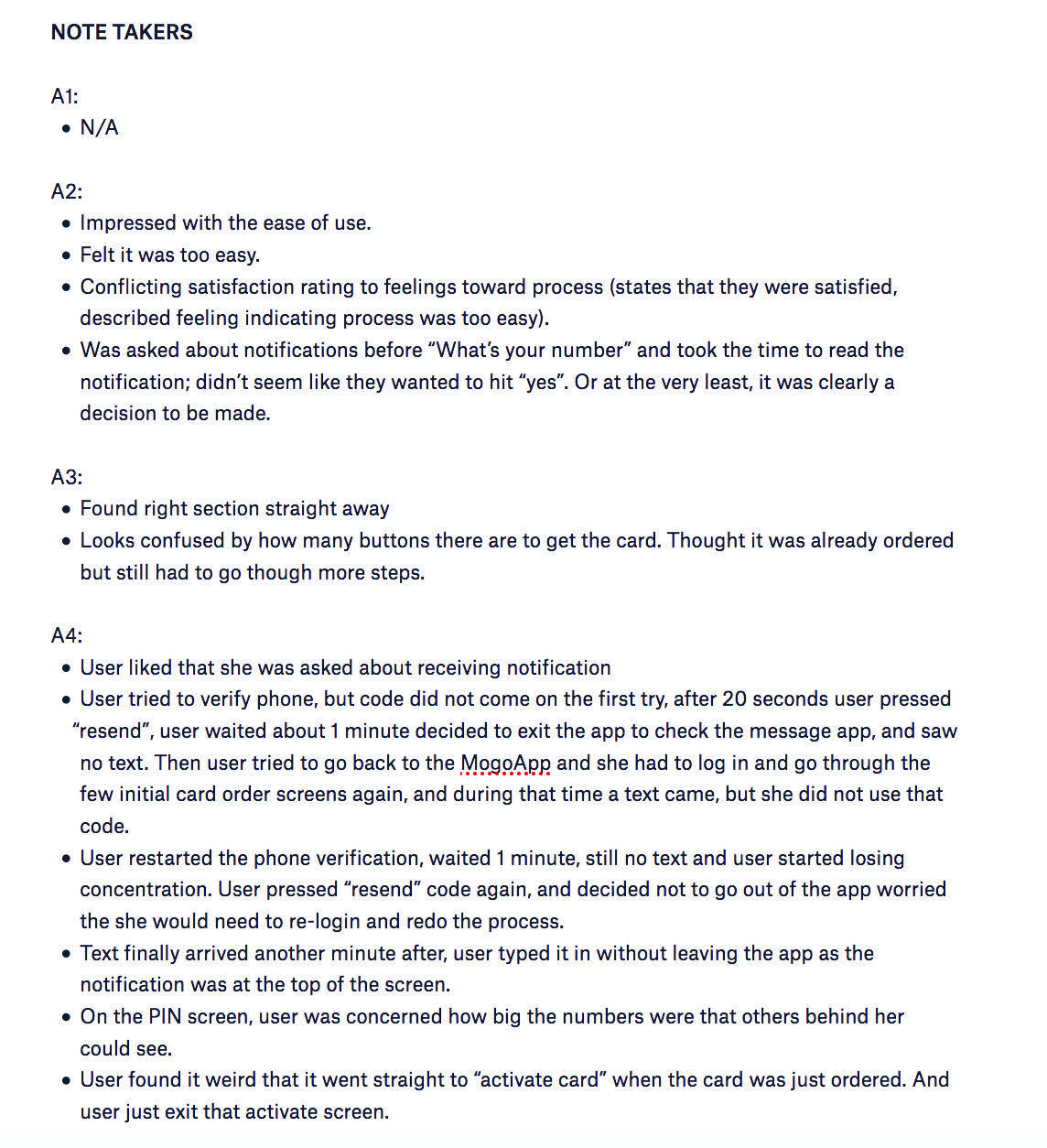
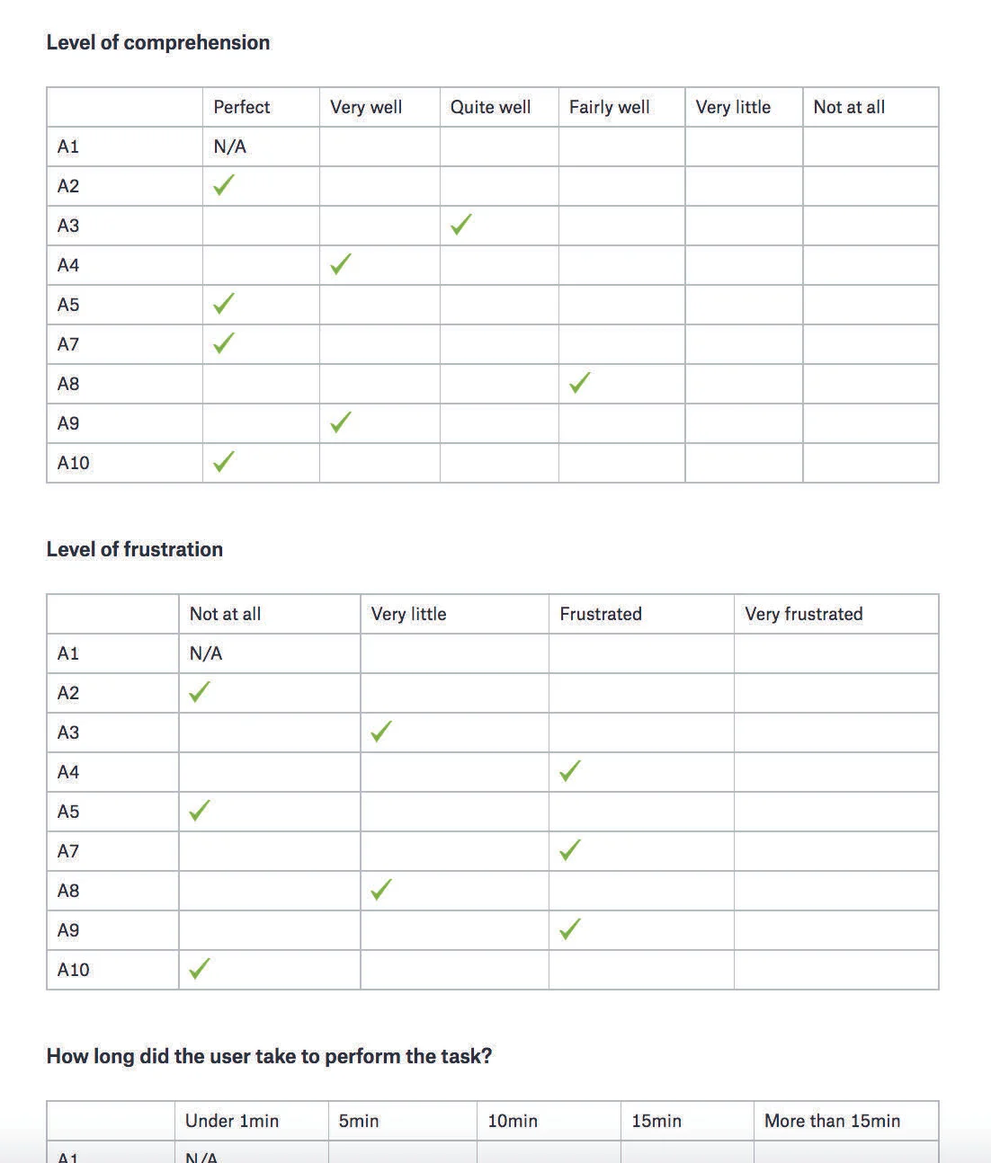
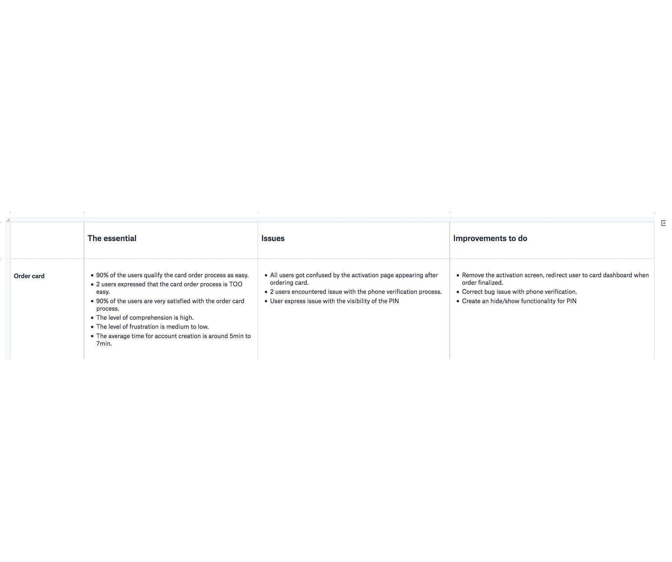
Fragments of the documentation created based on user testing results.
Example of part of the presentation created based on user testing results.
Accessibility
Mogo has been working towards improving the accessibility on their current web product. In order to move forward with that, I perform accessibility audits based on WCAG 2.0 Level A and AA guidelines. On the new features, however, the WCAG 2.0 standards have been considered and implemented during the design process.

Example of accessibility audit that I created for Mogo's marketing website.
Mogo towards Omnichannel experience
Another interesting point of my job at Mogo is the opportunity of working on the transition of the product to Omnichannel experience. With Mogo product, users can apply for a loan from their mobile device and have the option to get the loan directly on the Prepaid Visa MogoCard, allowing them to use money right away. All of this can be done on mobile app and web browser anywhere and anytime, avoiding any hassle. If the money on the MogoCard ends by the time user is at a line of a cashier, user can load money instantly from their bank account to the card using the mobile device before reaching the cashier.