

Digital Loan Application
The path to a fully digital loan experience
Challenge
When Mogo first implemented MogoLiquid Installment Loans many years ago, it was thought of to be a short-term product. Because of this, there was little investment into building a fully digital experience of the application process. Therefore, the loan application turned into a one page submission form that does not capture all the information we need from the users. All the missing information, including documents, were collected over chat (primarily), calls and emails. This results in long chats, several emails and outbound calls that cause a high cost per loan funded as well as high friction for the user.
Now MogoLiquid is a long-term loan product and funds 20% of the loan applications, in contrast with our line-of-credit product, MogoMini, that converts 80%. MogoMini application process is more efficient, requiring less effort over chat and outbound calls. Mogo’s strategy is to only have MogoLiquid as the loan product, but, in order to do that, MogoLiquid needs to first convert as good as MogoMini.
Objective
Member submitting a MogoLiquid new loan application will go through a logical, fast and structured flow that aim higher user’s satisfaction, less cost per loan funded (<$200) and conversion as high as MogoMini product (50% out of 100% of the total loans funded today).
Team
Myself as the Product Designer lead, a Junior Product Designer, a Product Manager, a Product Owner, a CRM manager, and a Technical Architect in the Program Level. Also the team has 2 BE software developers, 2 Front-end Developers (web), 4 Mobile Developers (iOS and Android), 3 QAs, and 2 CRM developers on the Team Level. The Program Level team also had support from customer service, finance and legal teams.
Product Design Strategy
I worked on this project for around a year and it was released in pieces. The team worked as Squad under Scaled Agile Framework (SAFe). My role on the project was to participate end-to-end, from research to delivery. Here is a high level idea of how the my design thinking process works together with a Agile cross-functional team:
Discovery (research)
Although I’ve used quite a few different ways of customer research to build user-centered products, each one of them come into play at different stages of the project.
With the objectives in mind, the first thing I needed to understand was why MogoMini application was converting better than MogoLiquid, so I could carefully replicate on the new Digital Loan Application what is working and improve what is not working from both products. In order to make this idea to succeed, some research were done along the process.
UX audit
I’ve gone through entire application process on MogoLiquid and MogoMini to identify the pain points based on a set of design principles and best practices (heuristics-based recommendations) such as readability, simplicity, performance, error handling, consistency, responsiveness etc. I’ve also worked on some ideas of how to tackle these pain points in the documentation. It turned out that MogoMini has far less friction points and broken experience comparing to MogoLiquid.
Analytics and metrics
In collaboration with analytics and growth teams, I could identify some of the key places along the application flow where most of the drop offs happened. Unfortunately analytics had some technical limitations that could not provide me full insights, so I had to use other ways in order to have better understanding where the drop offs were happening (and why) such as reading chats conversations, interviewing Customer Service team and watching FullStory.

MogoMini funnel for 3 months
Chats and calls research
Since a big part of the loan application experience is through chats and calls, I’ve gone through dozens of users account to understand deeper what is the what happens on those chats and calls. I realized that this is one of the most important tools that points me where are the biggest pain points on whole experience. Through the chats I could understand their main frustrations and behaviors. It also gave me insights of what parts of the digital experience didn’t work for them when analytics couldn’t track it. This kind of research requires me to make notes of most common issues and group them in order to find patterns that are relevant to my research.

Example of a common problem spotted over chat regarding user not trusting on our tools.
Shadowing
Another part of the research was flying to Winnipeg and observe how customer service interacts with our customers on inbound and outbound calls. Although that task was quite a bit time consuming, shadowing the customer service team helped me to validate some of the patterns I found through the chats as well as helped me to have a deeper understanding of user’s emotions and reactions for some issues that could be easily solved with a good user experience solution.
Interviews
In order to understand better the point of view of business regarding the goals for this project, I conducted some 1 on 1 with the key people from customer service, finance, payment processing etc. This stage was quite important to understand how we currently interact with our customers and their point of view of the problems, so I could connect the pieces and have a full understanding of the user journey and its pain points. It also helped me to start working on personas where I could validate it through email surveys.

Questions from the survey sent out to Mogo loan users to validate personas.
Card sorting (KJ method)
I also facilitated a card sorting exercise with a group of the Customer Service team to find out what are the main issues from their perceptive and how we can prioritize them in terms of severity. The study consisted of 60 minute sessions with 16 participants and I asked them to point the issues they find very common during the application process and how they would prioritize those issues. Based on points, I could find what issues I should focus most of my effort since I could cross check the results with all the data I had collected previously.

Visit to the Customer Service office in Winnipeg for UX research.
Define (findings)
After executing a series of research methods, analyzing and synthesizing my observations, I identified where were the biggest pain points on MogoMini and MogoLiquid products that could be potentially improved for the new Liquid Digital Loan Application. The strategy was to replicate part of the experience that is converting well from MogoMini and improve the problems so we minimize the risk of dropping conversion.
Personas
Personas were created based on a documentation from the Growth Team at Mogo. That team had a pretty good idea about demographics and some profiles based on the research they did in the past. I took that over, created personas based on that and used email survey to validate my assumptions. Money personas could tell me how stressed people can be while looking for a loan, but It turned out that there were more clusters of people than what was previously thought. When that happened, personas were pushed back to be worked on again on the near future. Unfortunately, I had to move one with this project without that and needed to work on solving problems in more of a holistic way.

User Journey
Creating the Current State User Journey based on personas was important for a better understanding of those pain points and helped me to work on a Future State User Journey which will support my design process and define better the features, requirements and the strategies who to accomplish them.
User Journey that I created based on research to understand how MogoMini loan application process work.
The problems
Among lots of findings, I want to highlight and dig into tho the most important ones that will give the biggest impact on the new application flow.
Application flow isn’t personalized according to user’s profile.
This results in a friction point by showing unnecessary steps for all users. Depending on the user profile and credit score, users can be exempted from providing specific information. Between 70-80% of our funded users needed to provide less information that what we currently ask.
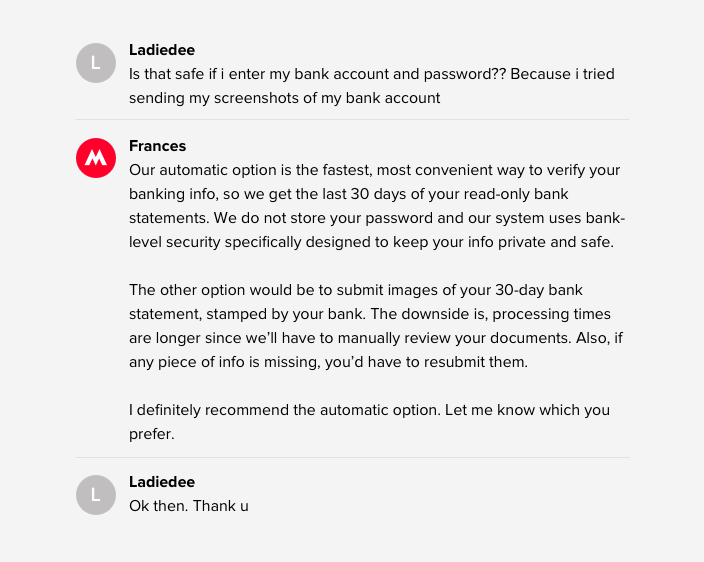
Mogo needs to verify user’s banking status through bank statements but user finds this step confusing and broken.
In order for Mogo to get user’s bank statements, user needs to either connect their bank through a third party company, so we automatically get the bank statements (90% of those users get funded) or send out stamped bank statements by email (60% of those users get funded). Through chats research and cart sorting and interview, I found a pattern where Mogo doesn’t do a good job in giving trust to its users to enter their credentials to connect their bank account. When they choose the second option, sending docs by email breaks the application flow; it’s hard to be tracked by Mogo’s team, causing frustration to the user and, therefore, drop-offs; and reviewing those docs is it is very time consuming. In summary, I need to focus on making the “connect bank” functionality the primary option for all users and make sure the conversion reaches close 88% (number of banks that the system supports among all the bank we have saved in our system).
My starting point to work on solutions for “connecting bank” was analyzing the data at a different angle. I had access to scripts that, after few iterations, ended up converting users to return to the application and connect their bank. But are there other possible reasons? Users might be dropping off not just because they don’t trust, but also because they don’t have credentials on hands at the moment of the loan application, according to some chats. Analytics couldn’t track this kind of users, who came back later and enter the credentials without chatting, but I will take that assumption as another problem to be solved on the user experience side.
Example of chat conversation that converts users by convincing them to go back to the application and connect their bank account. This is going to be used on the new iteration I am working on.
It’s unclear that Loan Protection is an optional fee.
One of the main issues brought up on my focus group, chats and interviews was users who are unhappy regarding Loan Protection fee. The option to uncheck loan protection is on the same screen as user selects their loan amount causing distraction. This screen needs to be carefully updated to just drop the number of complains about undesirable loan protection fees in users’ loans.
>50% of contacts wait in the live chat queue to get an update about their loan application.
Once user submits their information and documents, the application goes to a review process where it involves more chat, re-send documents (if applicable), further review, generating agreement etc. This whole process is very unclear to the user. As a result, they constantly call and chat to get updates. This results in slowing down our overall chat response times to other members.
~40% of active loan members contacts Mogo to make an additional payment
This is not really part of the loan application, but I found important to mention that this problem was also found on my research and was also very well known in the company. Users who want to make an extra payment had to chat or call Mogo to do so. Going through chats and interviews, I could find a pattern of, for example, how users calculate how much they want to pay and when they want to do it.
Ideate (Think)

Prototype to test mono-steps on wireframes
With a better understanding of the current loan applications experience and users’ pain points, here is where I start identifying solutions to the problems. The first ideas rarely survive up to the final product release, and that’s a great thing. Whenever I work in a project, the user experience always change on every iteration. Developers are heavily involved in this stage to make sure I won’t be suggesting anything that’s not realistic.
Solving non-personalized application flow: Mono-steps and progressive disclosure
In order to solve the problem that users should have personalized application flow depending on their profile, I split the long and scary forms into mono-steps where we ask one question at a time. This approach not only solves the solution of being able to remove and add screens depending on the user’s profile, but it reduces the cognitive load, making any decision point easier to the user.
I had to do a series of user testing to come up with a final solution for the mono-steps. After few iterations, I had a final version where it couldn’t be in production yet duo to some development limitations, so I ended up creating an alternative solution.

Few Iterations to add mono-steps into the loan application flow.
Brainstorming for bank verification and loan protection steps.
Those are the 2 main problems that needs to be solved inside of the loan application flow. The rest of the flow that converts well will be replicated for this first iteration, created web and mobile versions (iOS and Android), and applied a our new Design Systems.
Loan application user flow and wireframes in progress reflecting happy and unhappy paths.

First Ideas of bank verification flow
Like I mentioned on Findings, a high amount of users were not comfortable in proving their bank credentials, but they were easily convinced when we mentioned “read-only bank statement” and “we don’t store user’s credentials” over chat. The first idea is to add an introduction screen before “connect bank” form fields with the words we use on the chats. I also suggested to add a secondary screen with extra details about the connection for those customers who were still not comfortable in providing their bank credentials.
To solve the other issue regarding user needs to have the ability to come back later and enter their credentials, I worked on introducing functionality where user could close the app and we would remind them to come back in x hours. Unfortunately this idea was put out of scope, so then, instead, I replaced CANCEL button to '“X” so user could close the application without losing the info already provided. When user comes back, user sees “COMPLETE APPLICATION” button to continue.
Last, in order to convince users to not choose manual bank verification, I moved the option to the very bottom of the page and emphasized that’s a “non-instant solution” where user needs to email us stamped documents comparing to the Instant one. Users can also have access to the required docs before taking the decision of going into that path. The strategy is having the number of people wanting manual goes to close to 0% so we can remove it from the experience and send manual option only to the ones which bank is not supported.
Few wireframes of Bank verification process.
On the Loan Protection piece, I used FullStory to watch how people are using the screen together with customize loan functionality. I noticed that people plays around with numbers by jump from Loan Protection to edit loan amount until they come up with a payment they can afford. This tells me that my first idea of separating Loan Protection to another screen may create friction since Loan Protection and Loan Customization seemed to be tied together. That means Loan Protection and Loan Customization should stay together and, since the page converts well, my focus is doing changes to make Loan Protection clearer to our users.
Application statuses: solving the high number of contacts asking for an update
The idea to solve lining up on chat queue for an loan application updates is creating what we started calling “Application Statuses”. Every step of the process, mainly after application is submitted, should be displayed on user’s Dashboard: under review, under further review, chat with us, re-link bank, generating agreements, sign agreements etc. Some of those statuses require actions and some don’t. Also usually users at this point are anxious for an update, so the direction was to have a nice soft language instead of being too formal. Several iterations where done on this part of the project and was more about how much information we should provide to the user and in which moment of the process.

Left side sketch: working on ideas of application status,
Prototypes and usability studies
After creating wireframes, user flow, coming up with the first draft of the copy, this stage is where I work on interaction details, refine the final copy (including legal team), apply Design Systems and finalize user flows to be shared to developers. This is also the moment I converted the ideas into an interactive prototypes for usability studies.
Refining loan application flow
At this stage, I polished the wireframes and created prototypes to conduct a second usability study on both desktop and mobile prototypes. The testing was remotely and unmoderated. The questions I used covered pre-defined criteria like comprehension and satisfaction levels. I also used System Usability Scale (SUS) to get a success rate. The test was conducted with 5 testers (maximum benefit-cost ratio) through Validately.com. The results drove me to do few more iterations until I had a solid final version of the application flow.
High-fidelity mockups for the loan application (experience before the Bank Verification flow).
High-fidelity mockups for the Bank verification flow.
Loan application user flow

Before and after of Loan Protection

Before and after of loan application flow overall
For some part of the usability study, I tried to recruit Mogo users to mainly test part of the flow where the target was returned users. In order to do that, Customer Service added a question at the end of the every chat asking if user is willing to help us with feedback on unreleased versions of our products. The idea was quite promising, but the problem was teaching those users through email (or during the testing) about how do do the test without being moderated. The “think aloud” was quite hard to introduce and I required few email iterations, carefully changing questions etc. At the end of the day, the results were not that satisfactory, so I ended up using users from Validately.com.

One of the email iterations made to invite Mogo users for Usability study.

Questions for the System Usability Scale (SUS)
Once the results were satisfactory based on the key points and a SUS at 80.3 or higher, I was ready to move onto finalizing all screen sizes and different clients (web, iOS and mobile). We design primarily for iOS medium size (iPhone 7 and above) and apply the solutions to web and Android, keeping in mind the platform guidelines, limitations, libraries etc.

Video of part of loan application in test environment.
That’s where finally the Product Owner, Product Manager and I work on user stories and grooming. The stories usually come a bit before, but anything can change until testing is done and UI is approved by stakeholders. At this point, developers were happy with the solutions and will start scoping it once I deliver all the mockups. Analytics is also involved in this stage.
Application Statuses
For the Application Statuses, there were quite a few iterations until getting into the final one. I started trying to display a progress bar with every single different step of the process, but there was too much information for the user to digest. Also those steps could change along the way and it’s not ideal to just change the progress bar randomly. Another way I tried was providing status details upfront. The screens looked pretty overwhelming and those information could be added somewhere further in the process.

Few of many iterations I did for application status.
Additional payment
That was a very good project that was indirectly part of the new Digital Loan Application flow. When I worked on this project, this feature was totally brand new on the Dashboard. Additional payment were done through chats. So, therefore, chats turned into my main research point on this project. Through that I could understand how users calculates how much they want to pay extra, which was usually the total amount they could afford on that month (including regular payment). For example “Hi, I want to pay this month a total of $200 instead of my regular payment amount of $134”. The design fully respected those thoughts by displaying the total amount including regular payment when users selects paying on the same day as their regular payment.

Loan Dashboard - where users add an extra payment.

Reasons behind the design decisions
Outcomes and learnings
Outcomes
Few months after the first release, Liquid is now converting as good as Mini, reaching the goal we wanted. The number of loans funded jumped from 20% MogoLiquid and 80% MogoMini to 50%/50%. We still have some adjustments to do. Loan protection is now very clear to the user and, therefore, not converting well probably because of the high amount.
Regarding “Connect Bank”, the non-instant option at the very bottom of the screen is converting 11% (6% bounces back and forward) but the number of funded people is near 0%, which is a good thing. Serious customers tend to go through auto bank verification. We now felt confident in removing non-instant from the whole experience.
The new Digital Loan Application reduced time to fund from 10 days to 6 days. Over 50% of our applications today get funded within two days. That never happened before.
The mobile adoption increased by 15% since the new application was launched (~1 month).
Learnings
It will take some time to come up with a good way to recruit good quality of testers from Mogo customers to do unmoderated user testing. I should consider doing moderated ones for those type of testers.
Be customer obsessed together with my team made us accomplish far more than we would have ever been able to do alone.
A great product comes when product designer, product manager and developers have great communication, respecting each other’s opinions.
A proper scope is important to avoid quick and not well thought solutions just for the sake of shipping it.
Design to bring values to users. It is extremely important to understand our users and their goals, think critically, and challenge ideas if there is ambiguity. Design decisions should be supported by research and purpose.
Design to delight our users and develop a strong emotional connection with them. Mogo becomes more than just a product when users feel they own it.
Sometimes we dream about an amazing experience, but be ready to deal with constraints and challenge yourself to make something amazing even with those constraints.